
Three days ago, Apple had their yearly developer's conference, WWDC. They had a lot to show off this year, and I have a lot of thoughts on what they've shown. Let's break it down.
Apple Intelligence
The conference started with Apple Intelligence, which shouldn't have surprised many given the controversies surrounding it. They chose a surprising route of managing it however - to preface the other innovations with the AI stuff, to almost get it out of the way and sweep it under the rug. The updates they showed off were interesting, like foundation model API access, but it looks like it will still be a few more years before we see anything truly noteworthy.
Design
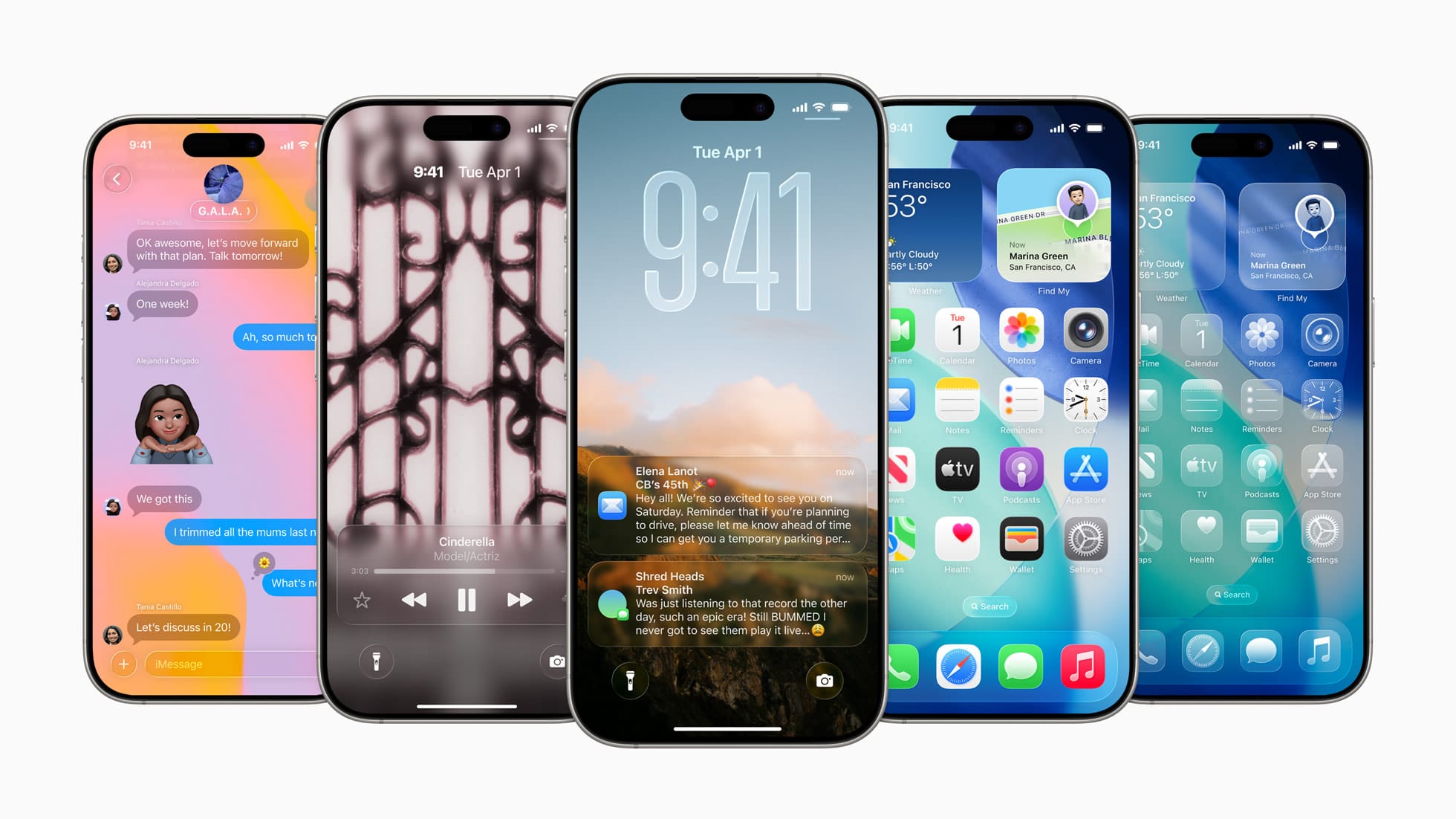
Next up was a long rumored design overhaul that unifies the different visual styles across the ecosystem. This design language is called Liquid Glass, and as someone who's had a few days to try it on the developer beta, I have a lot of thoughts.
Before I dive into them, I should emphasise that this is a developer beta. Things aren't perfect, and I'm not expecting them to be like a lot of other people are.
The good
The new, striking and bold glass design and accents are a beautiful shakeup to the age old iOS 7 frameworks that have seen countless imitations and revisions over the last 12 years. While it wasn't "broken" it was absolutely not reflective of the devices it ran on anymore.
I am extremely happy to see search bars moving to the bottom of the display, closer to where your thumb is. This is a UX change that frankly should have happened years ago.
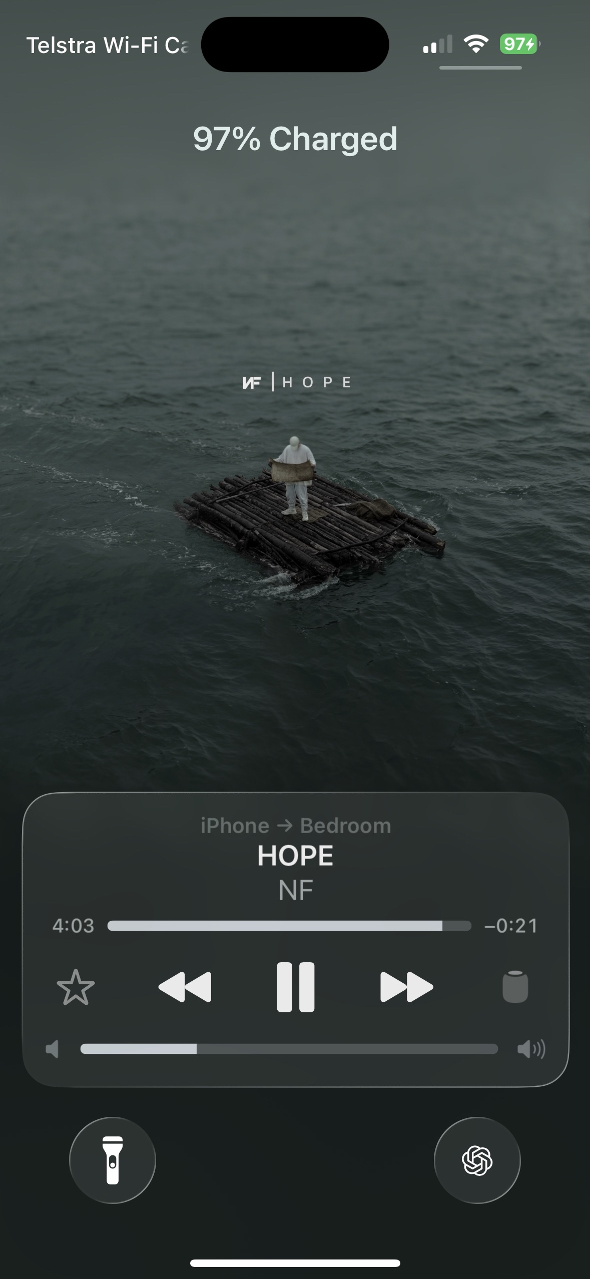
I'm also a massive fan of the new lock screens - especially the updated music lock screen that utilises the Tall assets introduced in Apple Music with iOS 17.
It has also lead to some interesting design choices in system apps, but I actually quite like them - I know that a lot of people will be resistant to change with a design change as large as this, but I believe they understand with changes so fundamental you either do or you don't. There is no try.
The bad.
The main issue that I see with this new design language is that it's going to be INCREDIBLY hard to conform to if you aren't writing apps with native SDKs. So they may end up with a very fractured UX for a while, amongst the sea of Electron and React Native apps that previously were able to imitate the appearance of the system UI due to how simple it was to replicate. This new framework is so graphically advanced that it simply might be impossible to replicate 1:1. I've also seen many people worry about the compute overhead of it's effects and shaders. While I do see their point, I also feel like Metal rendering and SwiftUI shaders have been so performant for so long, that this should be no issue 99% of the time.
The ugly.
Unfortunately, for all the praise I've given Liquid Glass, no redesign can be perfect. A lot of the HDR highlights and effects simply feel overdone, and I hope we get a way to tone them down closer to release. Many have noted readability issues, and while I do agree I think that's more a repercussion of it being a dev beta, and it'll be fixed closer to release, similar to the control center.
iOS 26
iOS 26 introduced a lot of changes that I love, and some I don't. The new design language breathes a lot of life into system apps, the new Hold Assist and Call Screening features - while having existed on Pixel phones for years - are a very welcome addition and have already proved very useful. The new Safari redesign is surprisingly intuitive and I like it. One thing I'm not a fan of is that they went back on the Photos app changes - I was actually a fan of the iOS 18 design, and this is an example of "there is no try." People cried before they took the time to give it a chance. Another negative change is the Wallet app, where tapping the card in the payment flow no longer lets you choose another one, which is a confusing UX downgrade.
iPadOS 26
I cannot test iPadOS 26 myself, but from what I can see I'm.. confused. They've introduced a menu bar, folders in the Dock, background tasks and another window system. It feels like they'll do anything possible to make sure they don't have to admit that iPads should just have some form of macOS, and they're blurring the line so much now that it just comes across as confusing, almost like an identity crisis for the device.

I feel like they need to admit that the iPad either needs to be a tablet or a computer, and stop pushing it towards this confusing hybrid. It only further muddies the appeal and target market for these devices.
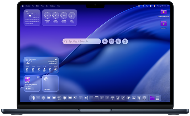
macOS Tahoe
macOS Tahoe was mainly focused on a design uplift, to unify the experience, but it also added some very interesting features.
The first of these is a Phone app for Mac. I feel like this is a solid precursor to Macs getting eSIM at some stage, but for now it further solidifies the handoff experience between your phone and Mac.
The next is Live Activities, which expanded to Mac, as well as CarPlay this year, which I appreciate because they are one of Apple's best innovations as of late and have seen great adoption.
The last surprise release was a revamp of Spotlight, to make it behave more like Raycast. You can now take actions straight from Spotlight, and access all your apps, data and automation from one place.
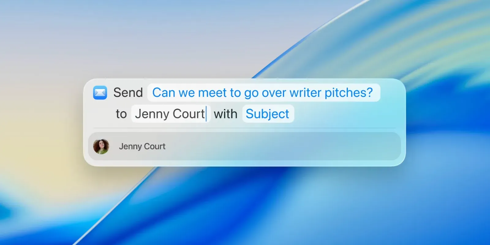
This is a very bold but welcome change, and I'm interested to see how it will progress and be adopted.
Conclusion
Overall, I'm happy to see Apple taking some bold moves this year, and I have faith that this will be a reset for the company, and I know other companies will still try and imitate the new design, no matter how much backlash it gets. Just look at the Vision Pro for your proof on that one. My one word to everyone currently testing the beta is - learn what a developer beta means.